How To Mix Color with Modern Design
Many of the same philosophies embodied by modern art and architecture – like innovation, utilitarianism and abstraction – can be found in modern interiors. According to this resource from MasterClass, “modern home design…rejected the maximalist tendencies of Victorian design in favor of a form-follows-function” approach to interiors. Modern interiors are typically characterized as sleek and slightly industrial. However, they also welcome the use of organic materials and often connect to the surrounding landscape. They tend to be minimalist, fairly restrained spaces accented with simple forms and neutral color palettes. Modern interiors place particular emphasis on the materials – and often the craftsmanship – of architectural elements, furniture and finishings. There is little adornment for adornment’s sake. With a “less is more” approach to design, modern interiors are minimally but not sparsely decorated. When we imagine bringing color into modern design, we typically think of earth tones like mustard yellow, sage green and deep brown. While the modern color palette does trend towards these muted earth tones, bold saturated colors are equally at home in modern interiors. After all, the Modernist period stretches all the way into the 1960s when pops of teal and cherry red were everywhere! From a strictly mid-century modern space to one that combines elements from multiple periods, learn how to use color with modern style interiors.
What is Modern Design?

Not to be confused with contemporary or postmodern design, modern design encompasses dozens of styles dating from the early to mid twentieth century. As Leanne Potts writes in a recent article for Better Homes & Gardens, “modernism spans from the early 1930s to 1965.” The design style “grew out of early 20th-century design movements, including the International Style and the Bauhaus.”
It covers the careers of many furniture, interior and building designers we still revere today. The work of architect Eero Saarinen, furniture designer Ray Eames and interior designer Rose Cumming all falls under the umbrella of Modernist design.
The Arts and Crafts Movement arguably kicked off modernism in England and America – encouraging a shift towards the natural and handmade. This Voices entry from the University of Chicago identifies the Arts & Crafts Movement as “a precursor to modern architecture and design.”
Spearheaded by brilliant minds like William Morris and Charles Robert Ashbee, the Arts & Crafts Movement heralded “basic forms, asymmetry, and stripped-back design.” This shift in the late 19th and early 20th century provided “a foundation and framework for the later, modern designs to emerge” shortly thereafter.
Embracing Modern Design in Today’s Interiors

Modernist design is remarkably diverse – even when one does not lump in features of postmodern and contemporary design. It can be warm and organic or cool and industrial. Some spaces strike the perfect balance with their color scheme and decorative accessories. The dining room pictured above — with a base of neutral colors and pop of bright blue in its color scheme — is an example.
Modernist interior design can be unique and artistic or manufactured and mass-produced. The latter might betray less romantic origins of modern design in the United States. We often tie modern design to the infancy – of what would eventually evolve into the ubiquity – of suburban America.
The post-WWII baby boom meant oodles of new homes were needed for fast growing families. Furniture, buildings and interiors with stark facades and clean lines were comparably easy to replicate.
Still, designers working during this period were extolled for their ingenuity, resourcefulness, playfulness and insight. They employed color, contrast and material in a way that had never been done before in residential interiors. Their execution of these design styles has left an indelible mark on our culture.
Here’s How to Use Color with Modern Style Interiors
In some ways, Modernism is what you make it. It might have an austere reputation. But beyond the streamlined profiles, tailored aesthetic and organic materials, Modernist design is surprisingly flexible. It can be soft or bold, neutral or colorful.
There are so many wonderful ways to be creative in a modern interior! Don’t be afraid to add color, pattern and personality to your living space. Get started with twelve of our best tips for bringing color into modern design.
#1 Pick a Few Period-Appropriate Art Pieces

Our first tip for bringing color into modern design is to pick a few-period appropriate art pieces. This is one of the simplest ways to bring color into your modern home — and can be one of the least expensive. You can find well-priced modern paintings dated between the 1920s and 1960s at thrift shops. Enthusiasts with a conservator’s eye can also shop for modern art through online auction sites like EBTH and ShopGoodwill.
Instead of prints, opt for paintings — preferably those with sgraffito, high impasto or unctuous oils — to add texture. Aside from the Josef Albers print in the lower left, all the pieces pictured above are oil on various substrates. Abstract forms and bold colors evoke the dynamism and experimentation for which art from this period is celebrated. The modern color palette in each piece is perfect for a Modernist interior.
From the upper left, we have Peter Miller’s Spiritual Awakening from the 1950s. According to 1stDibs’ description, Spiritual Awakening is “a powerful example of [Miller’s] formidable understanding of personal narrative…and the artistic layering of color.” Next, we have a screen print of Josef Albers’ Variant VII from Ten Variants — which was originally printed in 1967. In the center, we have an untitled 1961 oil on board piece by Sidney Siegal. Finally, we have Tommi Parzinger’s Butterflys, which dates to 1963 and was painted with oils on burlap.
#2 Draw Inspiration from Nature
View this post on Instagram
As mentioned above, Modern interior design often draws inspiration from nature. Whether a bright color or a neutral, Modernist spaces pull tones from the land, the sky and everything in between. While you might be tempted to pick a mustard yellow or earthy brown for your home’s paint colors, we recommend giving green center stage.
Create a calming environment with green colors like Sherwin Williams’ Evergreen Fog SW 9130. We love how the pale shade pictured above accentuates delicate millwork throughout this living room. Use the same color for the entire room — all four walls plus the ceiling — or create a focal point with an accent wall.
#3 Make it Meaningful

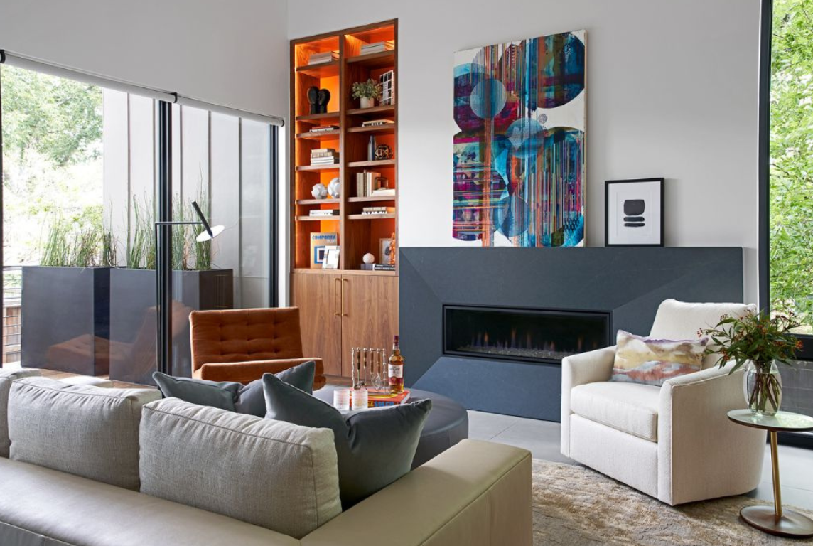
Third on our list of ideas for bringing color into modern design is to make the palette you choose meaningful. We chose colors that resonated with our clients when designing Braeswood Place. You can see this in every space — from the living room to the primary suite to the pool house.
We explain in the virtual home tour that our clients both collect art from their travels — all of which have a Southwestern theme. We allowed the hues from the art to inspire the color palette used throughout the home. This bold and vibrant yet calming and organic color palette nods to Southwestern sunsets and natural elements.
From the painted furniture to the leather upholstery, many of the colors we chose are cool-toned. The walnut paneling used throughout the entire home provides continuity and warmth from room to room. Paired with both neutral colors and bold accent colors like bright orange and sapphire blue, this walnut paneling is perfect for a Modernist home.
When decorating your own space, focus on what matters to you. Find ways to incorporate your personality and memories through color.
#4 Consider Texture to Keep Muted Colors From Falling Flat

The next tip in our post about how to use color with modern style is to consider texture when picking your palette. Some homeowners opt for a palette of neutral colors and choose not to add a pop of bright color.
When creating a neutral-toned space, it is important to pay close attention to the textures in your furniture, window treatments and other soft finishings. Without intriguing textures, neutral colors can fall flat.
#5 Research Designer Collections and Color Palettes from Paint Companies
View this post on Instagram
Next, we recommend researching designer collections and color palettes from paint manufacturers. Companies like Sherwin Williams, Behr and Benjamin Moore have all released Modernist color palettes.
Some are inspired by a specific place — like Sherwin Williams’ Desert Minimalist palette. Others wall paint collections are more general. For example, Benjamin Moore’s Mid-Century Modern Color Palette, which includes fan favorites like Incense Stick and Terra Cotta Tile.
Home furnishings and fabrics companies like British brand Scion also offer collections inspired by Modernist designs. For example, Scion’s Mid-Century Modern wallpaper collection includes colorful prints like Padukka in Twilight and Lohko in Paprika.
Pictured above is a fireplace surround covered in Stan Bitters ceramic tile. Hand-formed tile from Bitters’ latest collaboration with Heath Ceramics is now available in four Modernist shades. These include Mid-Century White, Museum Black, Modern Blue and Barley.
#6 Flip Through a Book of Modernist Interiors

Along the same lines, we suggest flipping through a book of Modernist interiors for a little extra inspiration. With detailed photos from famous homes and iconic furniture collections, all the books pictured above are excellent options.
Our favorites are Phaidon’s Herman Miller: A Way of Living and Elizabeth A. T. Smith’s Case Study Houses, which she designed for Taschen. Another great design book filled with color is Frank Lloyd Wright’s Interiors by Thomas A. Heinz.
#7 Look Beyond American Modernism
View this post on Instagram
Our next tip is to look beyond American Modernism when choosing colors for your home. Seek international inspiration instead of focusing on American architects and interior designers. In her article “Modern Color Schemes” for Better Homes & Gardens, Sarah Egge elaborates.
Egge writes that colors “inspired by a Chinese silk tapestry, a Moroccan lantern, or an Afghan rug [create] depth and intensity.” Of course, Egge acknowledges that a “worldly palette can exist in any decorating style.” In Modernist spaces, however, these colors balance “minimalist collections, spare architecture, and clean-lined furnishings.”
We suggest turning to the Italians. With its rich colors, luxurious textures and incredible craftsmanship, Italian Modernism is an endless source of inspiration for designers all around the world.
#8 Add Color with Vintage Rugs, Window Treatments and Wallpaper

Eighth on our list is to add color with vintage rugs, bold window treatments and patterned wallpapers. A patterned rug or drapes with embroidered trim can add the pop of color your space needs. For the family room of our Braeswood Place project, we chose an abstract wallcovering by Lindsay Cowles. Paired with aqua-colored leather ottomans and an apricot accent chair, this wallpaper adds interest and dynamism to an otherwise serene space.
#9 Embrace Bold Colors Inspired by Early Modernism

Our ninth tip is to embrace bold colors inspired by Early Modernism instead of limiting yourself to earth tones. In “The Changing Hues of Modern Design” from Form + Field, we learn that early Modernist artists “favored geometric forms and primary colors.” Furniture makers, architects, artists and designers all embraced these “saturated primary colors” during the movement’s infancy.
Of course, Red and Blue Chair by Dutch interior designer, architect and furniture maker Gerrit Rietveld is an absolute icon of this period. According to Form + Field, this 1918 creation was actually one of the very first pieces to “usher in Modernist design.” Others like Marcel Breuer, Jean Royère, Florence Knoll and Josef Albers all embraced striking primary colors and bold jewel tones.
#10 Jazz It Up with Jewel Tones

To that point, we suggest jazzing up your Modernist interior with jewel tones like the sapphire blue and amethyst colors pictured above. The blue Lawson Fenning console table from the dining room of our Braeswood Place project adds the perfect pop to an otherwise neutral space. Custom-made pillows from Jim Thompson and a bench upholstered in eggplant Jerry Pair leather bring jewel tones to the primary suite and guest bedroom.
#11 Let Statement Lighting Provide Pops of Color

Nothing sets the mood of a space quite like lighting. And few design elements make a statement as bold as a grand chandelier or funky table lamp. However, light fixtures are an often-missed opportunity to infuse interiors with color. Illuminate your space while incorporating bold hues like lime green, rose pink, emerald and sky blue through the fixtures you choose.
Pictured above are some of our favorite Modernist and Mid-Century Modern-inspired light fixtures from 1stDibs. From the far left, these include a 1950s Svend Aage floor lamp created by Holm Sorenson & Co in Denmark. Next we have two ceramic table lamps — one from the 1970s and the other of the mid-century period.
To the far right, we have a Piedra rose stone flush mount fixture from l’aviva home. We also feature a Ludovico de Santillana pendant from the 1970s. In the center is an Italian Modern Campana Three-Tier Pendant in Brass & Enamel from Blueprint Lighting.
#12 Don’t Forget the Front Door!
View this post on Instagram
Just as homeowners forget to add color with lighting, so do they neglect their doors and windows. When infusing your home with colors from the Modernist period, do not forget about your front door! As noted in our “Ultimate Guide to Front Door Interior Design,” your front door “invites everyone to explore the home, to imagine what’s inside.” Why not intrigue guests with a pop of color before they even enter your home?
How Did You Add Color to Your Modern Home?
Let us know how you already added color to your modern interior or plan to do so in the comments below. Ready to remodel or moving into a new construction home? Feel free to connect with our team about your upcoming project.