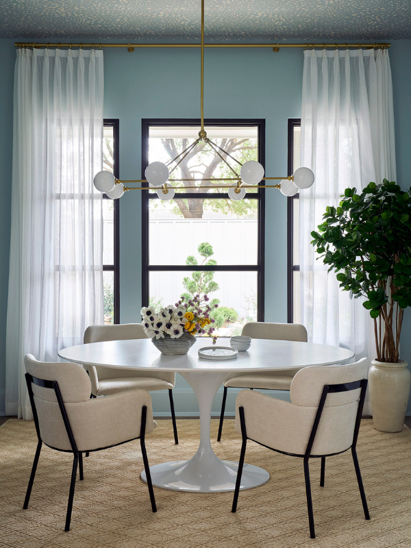
We love designing with color and selecting hues that match our client’s personality. Whether you’re using color on the ceiling or as an accent wall, color adds an extra visual dimension to the room. The key to using color is balance. Mixing bold hues with neutrals and lighter tones ensures that the space is well-balanced and easy on your eye. One of our favorite colors to incorporate into our designs is blue. So, what are the best blue paint colors?
Why Choose a Blue Paint Color?
Whether you are looking to go bold, timeless, or sophisticated, there are plenty of blue paint colors to select from. The color blue gives a sense of relaxation and peace. Studies show it can lower our heart rates and blood pressure.
People associate blue with the sky and sea, which usually encourages positive feelings. Whether you decide to add blue to your ceiling or use it on the walls, it adds depth and character to the room’s story. Bringing color into your space allows you to add personality and fun to your design.
Our team is excited to share the best blue paint colors to use in your home. We love using blue in kid spaces, studies, and powder rooms. In addition, using blue paint as an accent in more formal areas is a great way to add visual interest. Below are our designer-approved best blue paint colors!
The 12 Best Blue Paint Colors for Gorgeous Interiors

1. Benjamin Moore Little Falls 1621
A balanced mix of gray and blue create this hazy, mid-tone shade. This is one of our favorite blue paint colors because is works with traditional or modern styles. It is extremely versatile. BM Little Falls is playful enough to use in mudrooms and sophisticated enough to use in an adult’s study.

2. Benjamin Moore Hale Navy HC-154
This classic navy is the perfect mix of maritime and modern. Inspired by America’s historic landmarks, BM Navy Hale is a part of Benjamin Moore’s Historical Collection. Hale Navy sits well in any light and does not read gray or dull as some blues can. If you’re looking for a dark navy blue paint, this is for you!
3. Benjamin Moore Van Courtland Blue HC-145
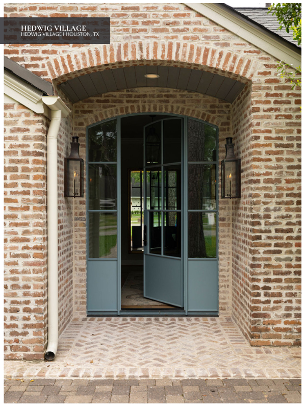
An elegant Old World blue, Benjamin Moore Van Courtland is on the top of our favorites list. This timeless shade effortlessly spans a range of style and sensibilities. Our team selected this blue paint color for the front door of our Hedwig Village renovation. We used the same color on the shutters and accents throughout the home.
4. Farrow & Ball Borrowed Light
According to Farrow & Ball, Borrowed Light “evokes the color of summer skies. It is a wonderfully pale blue named after the delicate light that cascaded through small windows and fan lights.” This light color and others similar can be seen on the outdoor porch ceilings in the South, including in South Carolina, Texas, and Georgia.
What started as a Gullah Geechee tradition to keep spirits of the dead out of your home, has turned into a beautiful way to add color to the exterior of your home. Plus, it’s thought to keep wasps from nesting on your porch!

5. Sherwin-Williams Inkwell SW 6992
Even though this paint is closer to a black hue, we had to include Inkwell! One of Laura’s favorites, Inkwell does have a hint of blue. Sure to bring drama to any space, we love using Inkwell in small spaces such as powder rooms or home bars. We love a room with a lot of contrast and this dark, inky shade pairs well with brighter whites and ivories.
6. Sherwin-Williams Dark Night SW 6237
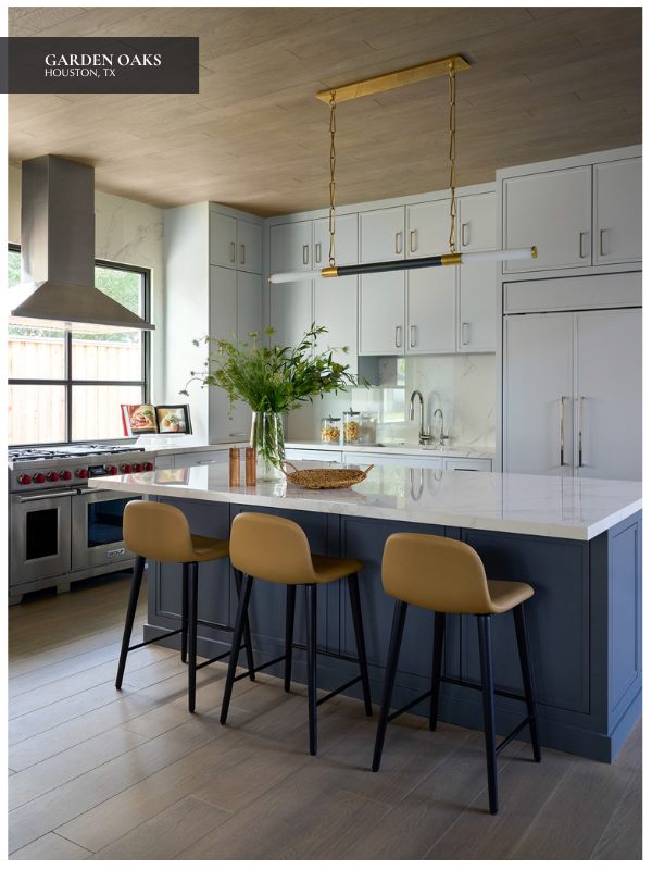
Selecting deep, bold hues for kitchen cabinetry creates an unexpectedly cozy and dramatic space that serves as the heart of every home. Sherwin-Williams Dark Night is one of our favorites. These impactful blues allow for a lovely contrast when paired with lighter natural or quartz countertops.

7. Sherwin-Williams Wall Street SW 7665
Wall Street is a handsome, neutral blue paint color with a glimpse of navy and steel. Depending on your light, it can read like a gray-blue. Wall Street complements a modern design perfectly.
8. Sherwin-Williams Take Five SW 6513
This periwinkle blue is a soft blend of blue and violet. With a touch of feminism, Take Five is calming and tranquil. Since it absorbs a moderate amount of light, you can paint full rooms with this blue paint color. We love this for girl’s bedrooms and bathrooms.
9. Sherwin-Williams Rainwashed SW 6211
Rainwashed is a part of Sherwin-Williams Recharge Collection. This palette works in tandem with supporting accents to evoke a feeling of renewed energy. This soft blue-green is perfect for a nursery or guest bedroom.

10. Sherwin-Williams Sea Serpent SW 7615
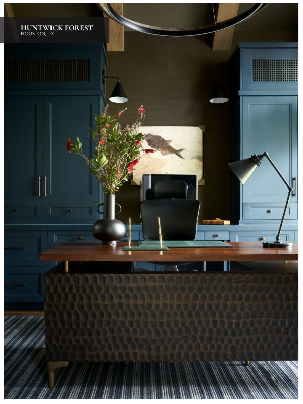
If you’re looking to create a sophisticated statement, Sherwin-Williams Sea Serpent is your hue. This dark hue had a small amount of gray that adds character and is statement worthy. We selected this gorgeous color for the cabinets in our Rice Residence bar.
11. Sherwin-Williams Baby Blue Eyes SW 9070
In the purple family, Baby Blue Eyes reads blue in many lights. This playful hue is perfect for kid’s bedrooms or laundry rooms.

12. Sherwin-Williams Web Gray SW 7075
This paint color has cool tones with hints of gray. If you use this paint in a room with lots of natural light, it will look on the lighter side. When used in dark spaces, it looks deeper and gives off a moody appeal. We selected to use it in the University Place Study to create a handsome home office.
How to Style Blue in Your Home: Paint, Wallpaper, and Beyond
Blue is a perennial favorite among designers for its versatility, timeless appeal, and calming qualities. Whether you gravitate towards deep navy, breezy aquas, or soft powder blues, this hue offers endless possibilities for styling your home. From understanding how blue interacts with light to choosing the right paint or wallpaper, here’s how to make the most of this versatile color.
Styling Blue in Your Home
Blue is a transformative color that can evoke feelings of calm, energy, or sophistication depending on how it’s styled. For example, pair blue with crisp whites, grays, or beiges for a timeless look. A navy accent wall comes alive with white trim and light furniture, while powder blues create a serene atmosphere when paired with sandy beige tones.
Add Warmth with Natural Elements
Blue can sometimes feel cool, but incorporating warm materials like wood, leather, or brass balances the room. For example, a deep blue dining room feels cozy with a wooden table and gold light fixtures.
Accentuate with Metallics
Metallics, like brass or silver, beautifully complement blue tones. Pair darker blues with brass or gold for an opulent feel, or combine lighter blues with silver for a modern and sophisticated aesthetic.
How Lighting Affects Blue Paint
Lighting plays the most important role in how blue appears in a room. For example, north-facing rooms have cooler, grayish light. To counteract this effect, opt for warmer blues with green undertones like Palladian Blue (HC-144) or Beach Glass (1564) by Benjamin Moore. If you prefer a more vibrant blue, Blue Hydrangea (#2067-60) offers a true blue with a hint of violet that can feel balanced in these cooler spaces.
Bathed in warm light throughout the day, south-facing rooms make cooler blues, like Farrow & Ball’s Lulworth Blue, shine. Richer navies also feel balanced here. Alternatively, east-facing rooms enjoy bright morning light and cooler tones in the afternoon. Blues with gray or green undertones, like Sherwin-Williams’ Misty, work well. Last but not least, the golden hues of the late afternoon light enhance warmer blues in west-facing rooms, so consider a color like Valspar’s Santorini Blue.
What About Artificial Light?
- Warm LED Bulbs: Enhance blues with green or teal undertones, making them feel cozier.
- Cool LED Bulbs: Highlight blue’s cooler properties, ideal for modern spaces.
- Incandescent Bulbs: Add a soft, golden glow to blues, softening their intensity.
The Best Blues for Specific Spaces
Blue works beautifully in every room, but the right shade can elevate the mood and functionality of each space.
Living Room
For a calming yet stylish space, choose muted tones like Benjamin Moore’s Smoke and pair them with cream furniture and brass accents. A navy feature wall creates a focal point, especially when paired with statement artwork or mirrors.
Kitchen or Dining Room
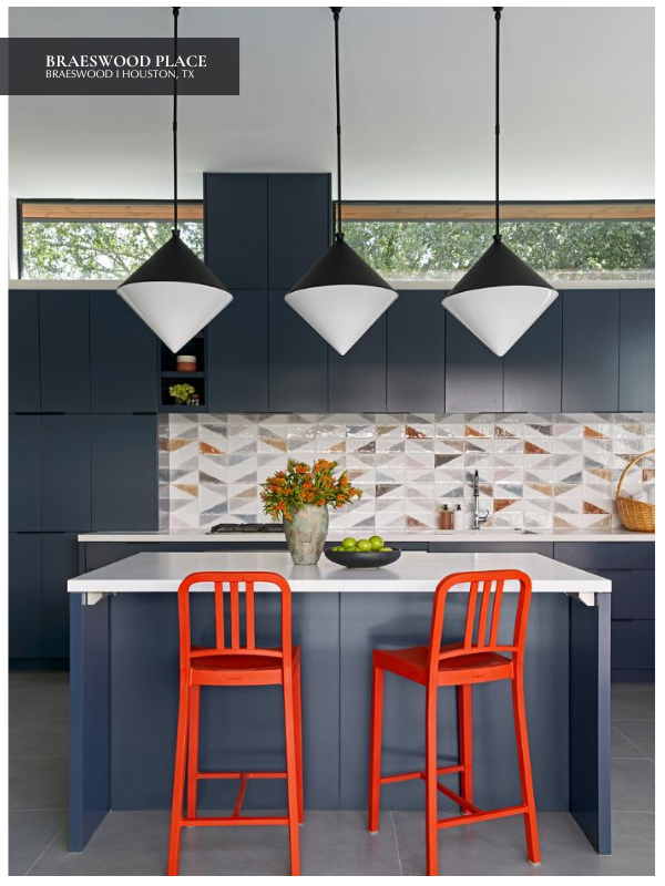
Blue cabinetry is a chic trend. Try a dusty blue like Farrow & Ball’s Stiffkey Blue paired with white quartz countertops and brass hardware. Opt for a blue tile backsplash for subtler touches like light blue zellige tiles.
Bedroom
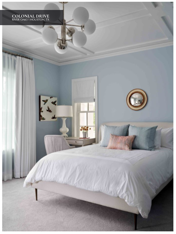
Soft, dreamy blues like Benjamin Moore’s Breath of Fresh Air encourage relaxation. Pair with white linens and natural fiber rugs for a serene retreat. To add depth, try navy curtains or a patterned blue quilt.
Bathroom
Light blues reflect beautifully in smaller spaces, giving an airy feel. Consider Farrow & Ball’s Borrowed Light for walls or tiles. Darker blues, such as Sherwin-Williams’ Naval, bring drama and pair wonderfully with white accents.
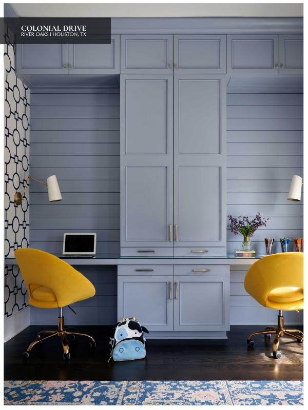
Home Office
Blues with gray undertones, like Sherwin-Williams’ Slate Blue, enhance focus and productivity. Opt for a deeper blue paired with warm wood tones for a moody, intellectual vibe.
Seeking Added Texture? Opt for Blue Wallpaper Instead.
If you’re hesitant about committing to blue paint, blue wallpaper offers an alternative that brings texture and personality to your space. Let’s take a look at how to use it effectively.
Patterned Wallpaper for Personality
Botanical prints in teal or navy can bring life to a powder room or dining area, while geometric patterns in cobalt add a modern touch to entryways or hallways.
Textured Wallpapers
Grasscloth wallpaper in shades of blue adds depth and a luxurious feel. Metallic accents woven into blue wallpaper provide a subtle glamour.
Accent Walls
Instead of covering an entire room, try blue wallpaper on a single wall behind a bed or sofa for a striking focal point. Pair it with neutral walls and furniture to let the wallpaper shine.
Mural-Style Wallpapers
Murals featuring ocean scenes, abstract clouds, or watercolor effects add a dreamy and artistic touch, making them perfect for bedrooms or creative spaces.
Blue and Its Perfect Pairings
Pairing blue with other colors can create a wide range of aesthetics. Here are some popular combinations:
Blue and White
This classic pairing feels fresh and timeless, perfect for coastal or traditional styles. Use white furniture and bright blue accents like rugs or throw pillows for a crisp look.
Blue and Yellow
For a cheerful, sunny vibe, add pops of yellow. Mustard accents with navy walls create a playful yet sophisticated balance.
Blue and Green
Neighboring on the color wheel, these hues create harmony. Pair turquoise with olive or navy with emerald for an unexpected twist. We love a green blue paint color!
Blue and Pink
Soft blues and blush pinks feel romantic and airy, while navy with hot pink adds energy and boldness.
Blue and Gray
Perfect for modern, minimalist spaces, this pairing exudes sophistication. Steel blue with dove gray is soothing yet contemporary.
Why Designers Love Blue
Blue is beloved for its versatility and emotional impact. It can evoke peace and stability, which makes it ideal for bedrooms and bathrooms, or energize a space when used in brighter, bolder shades. Its adaptability across styles, whether coastal, contemporary, or traditional, makes it absolutely timeless.
Did you love this post on the Journal? Be sure to read “Bold Brown Paint Colors Like Benjamin Moore’s 2026 Color of the Year,” too.